Illustration variations: Beauty and the Beast
Here’s a question: what is the first image that pops into your head when it comes to Beauty and the Beast? Am I wrong if I say that 10 out 10 of you thought of Belle’s yellow evening frock?
It is interesting to see how some stories have such iconic imagery that they practically burned into our minds – with a heavy influence by Walt Disney – while others have countless illustrative interpretations. For example, Red Riding Hood is among illustrators’ favourite topics, perhaps because of the ever-green colour combination of red, white and black, or the mystic forest.
Beauty and the Beast however, is a tale that most of us connect with Walt Disney’s movie, even though it offers many illustrative opportunities, mainly thanks to the Beast.
Beauty and the Beast has been at the back of my mind for a long time, so I thought I’d share some interpretations that are rather far from the Walt Disney version.
What we know about the storyline
The first written account of the Beauty and the Beast story dates back to 18th century Fance, and just like the Grimm brothers’ tales, it is known in several variations. Even though it is not a typical folk story (the author is Gabrielle-Suzanne Barbot de Villeneuve), similar stories have been known since the 2nd century, when nice young ladies married pigs. :D
You can read versions of the story here and here. Perhaps it’s not surprising, that the original piece – like some other old childrens stories – is much darker and more brutal than the sweet-smelling movie, while it is also more complicated, with more characters and conflicts.
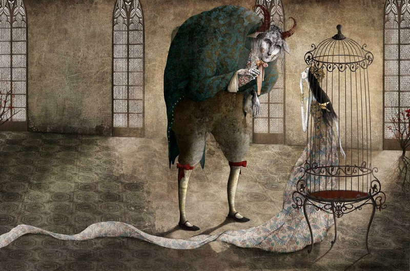
Illustration variations: Gabriel Pacheco
An all-time favourite. Dark and mystic, yet it has all the fairy-atmosphere of an enchanted castle. I absolutely love the colour palette, which is almost monocrome.

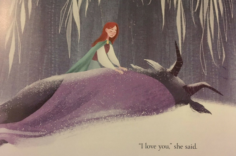
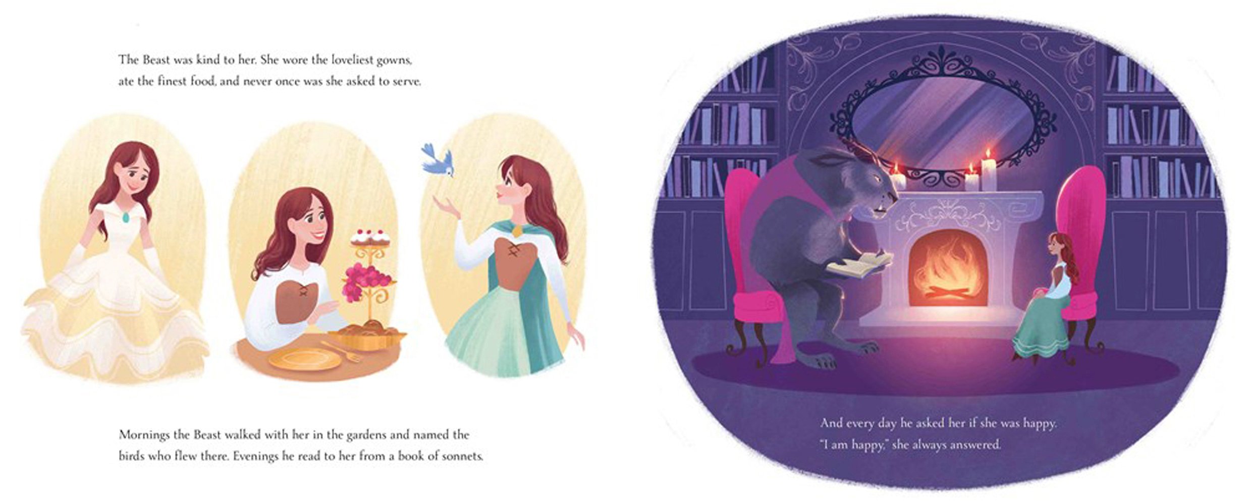
Meg Park
A series of illustrations for children, without a doubt. In fact, I think the audience for this version might just be the same as the movie’s, yet the style is quite different. I like Meg Park’s colour palette too, the blues and purples are rich, yet convey the winter cold perfectly.

David Sala
David Sala’s version has a touch of the Arts and Crafts movement. I like the technique of collage. The Beast does not look like a friendly figure here.


Some more Beasts
The story’s most interesting bit is definitely the Beast, because there is no reference to what he should look like. The artists in order are: Julie Rouvière, Ania Mohrbacher és Runa Rudaya

My own interpretations
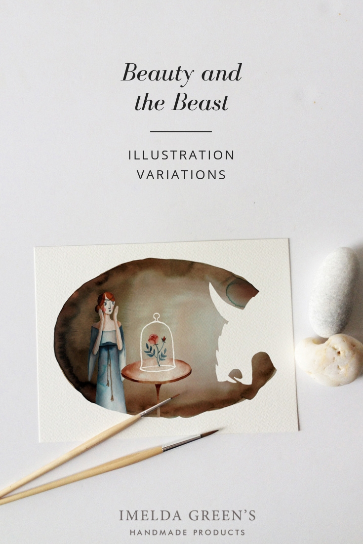
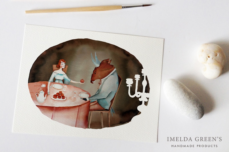
One reason why I dug so deep about Beauty and the Beast is that I also made a couple of illustrations for this tale. In 2017 I found a small series of children’s books which tell a story without words, and since then it’s been my ambition to create a similar piece for Beauty and the Beast. The project has not yet reached that state (and nor will it, unless there is some serious demand), but I’ve created a few pictures, which I loved painting.


The first version is made with pen and ink, and the interesting bit lies in the ‘costume design’, which is inspired by 16th century fashion (even though the castle itself might remind you more of Marie Antoinette era). I found the idea interesting, to set a story written in the 18th century some 200 years previously, when ruffs were still in fashion.
While I find these ink pictures interesting, my expertise lies in watercolours. I’ve always wanted to try the combination of brown and blue, as well as the use of negative shapes. The original story does not include the bit about the rose, it came from Walt Disney’s fantasy, but all the same, I liked the idea too much to leave it out.

Which is your favourite version? Would you be interested in an illustrated children’s book without words?
