7 Harry Potter covers that will satisfy a graphic designer
As a Harry Potter fan and graphic artist, I’ve always found HP covers a little bit annoying. The first edition book covers somehow never managed to convey that magical – and towards the end of the series, pretty dark atmosphere that Rowling’s writing expressed.
Since then, the books have been re-published a number of times with new covers (that I liked only slightly better than the first edition), but graphic designers all over the world have been inspired to create their own versions for the series. Some of these projects have been published, others remained “portfolio projects”, but all of them are beautiful.
The interesting bit about today’s collection is that every artist approached the Harry Potter series with a different eye. Some showed the fairytale aspect of the story – just like the original covers – others decided to put forward the more serious message hidden in HP, and some designers approached the collection with an artistic eye.
Kincső Nagy
First up is a cover designed by a Hungarian artist. Kincső is a graphic designer, who graduated from graphic design academy with this special project. Not only are the covers uniquely designed, but the interior illustrations are also worth taking a look. Unfortunately, the books never became mass-produced, but those interested in graphic design / illustration should look through all the pictures and read Kincső’s words about the project HERE.
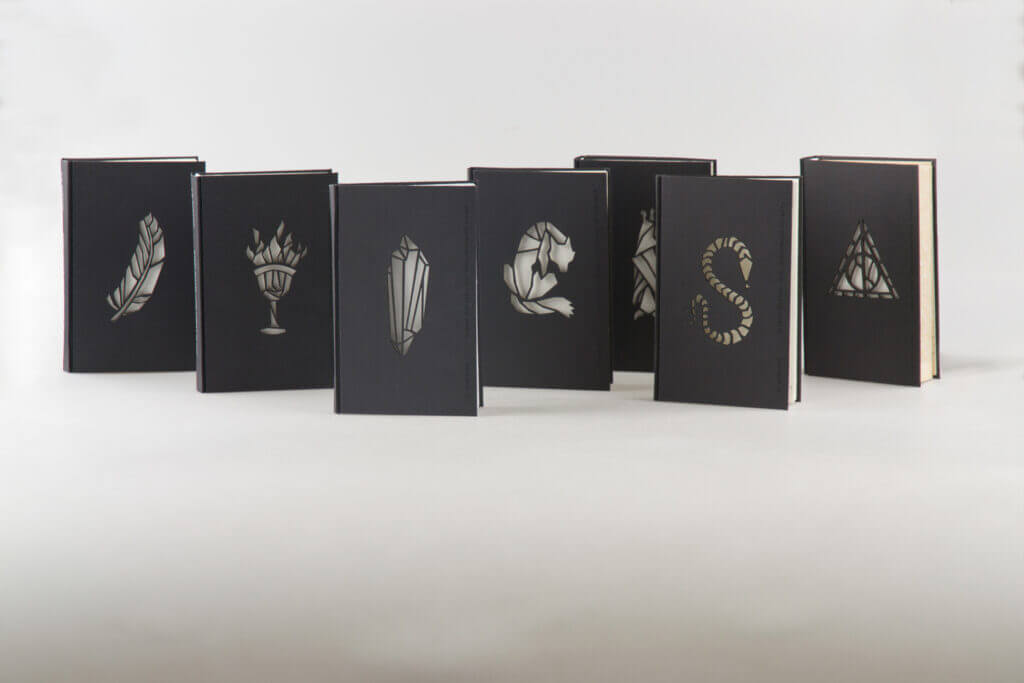

You can find further pictures of the interior illustrations on Kincső’s Behance page.
Andrew Davidson
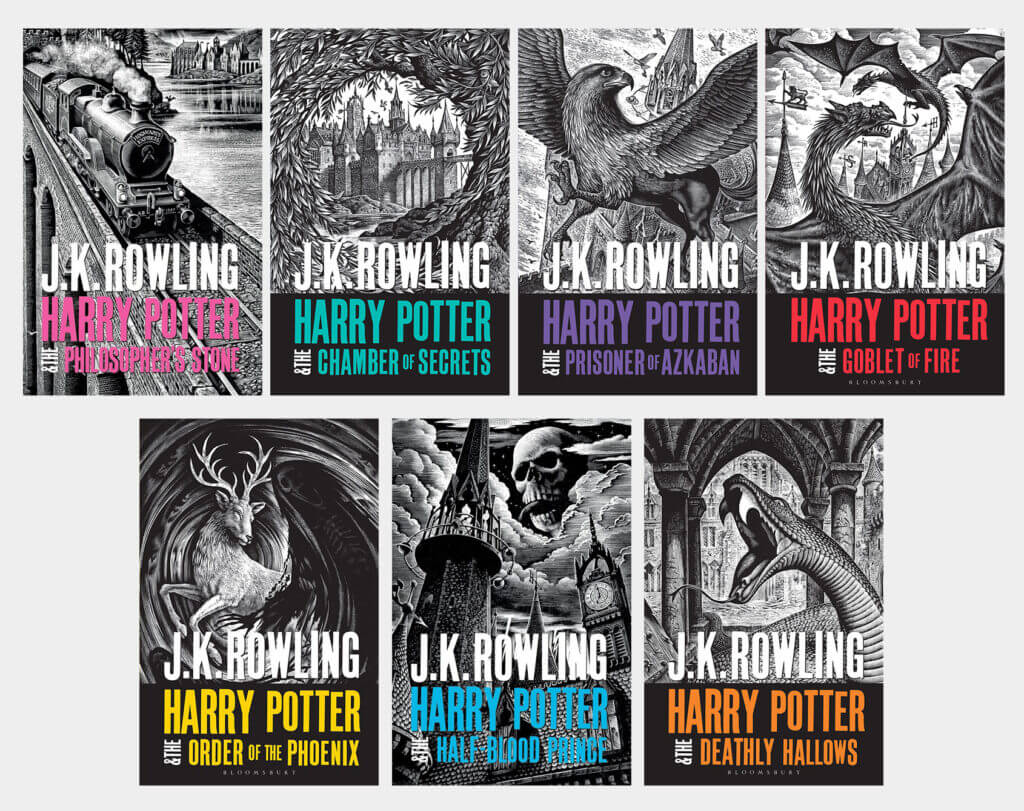
The “adult” Harry Potter covers currently published by Bloomsbury (2020) are one of my all-time favourites. I love how the old-fashioned, amazingly detailed woodcuts work together with the colourful, modern fonts. Another added layer of design work is that they added colour to the same illustrations on the paperback editions.
By the way, it is worth taking a look at the portfolio of Andrew Davidson. In addition to the amazing woodcuts, his paintings are also very exciting.
Rachael Lancester
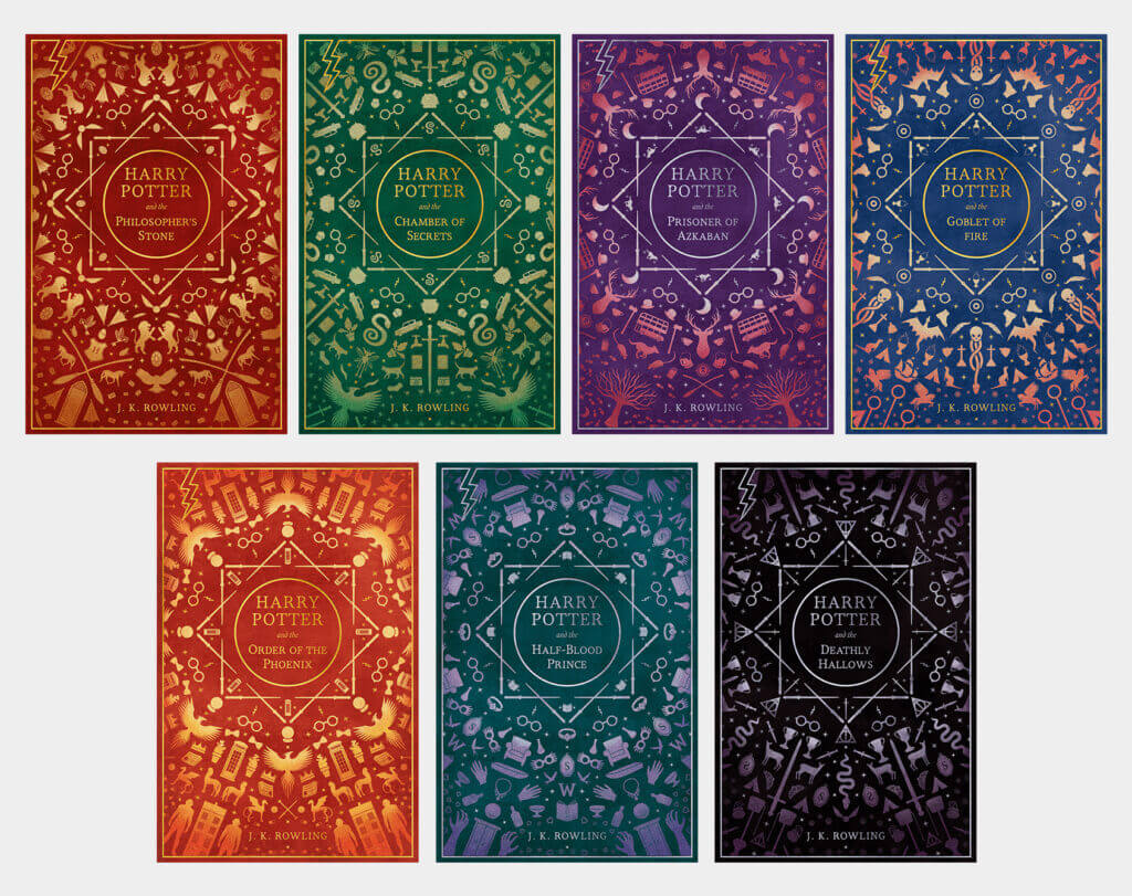
Another minimalist approach that operates with repeating patterns. If you take your time with untangling these covers, you can see that the patterns are made up of different objects and beings that are specific to the given book. Although I’m not sure how consciously the colours were chosen, Rachael was certainly right about book No. 6 and 7: the mood is definitely the darkest in the last two books.
You can see the book covers in more detail on Rachael Behance’s page.
Juniper Books
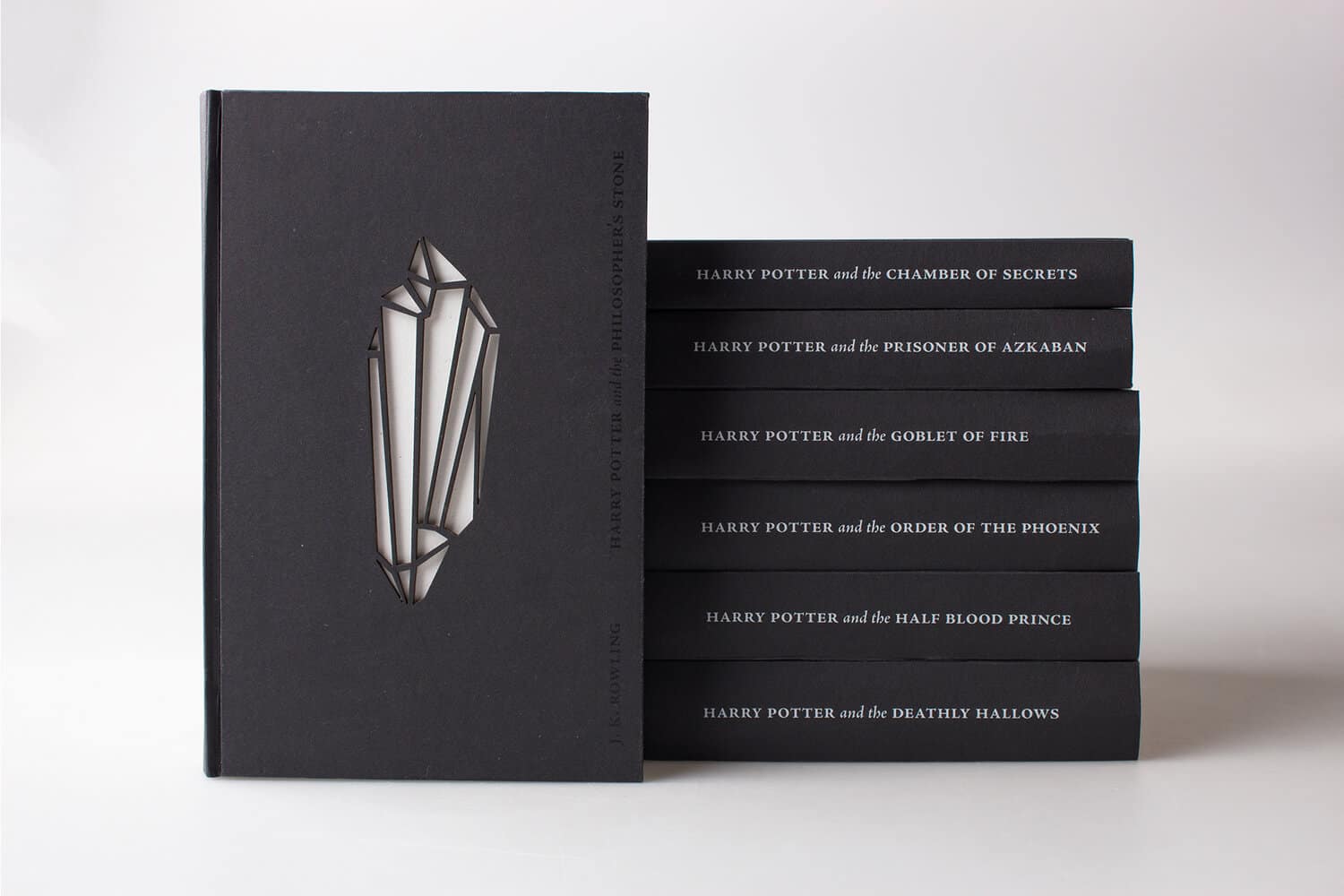
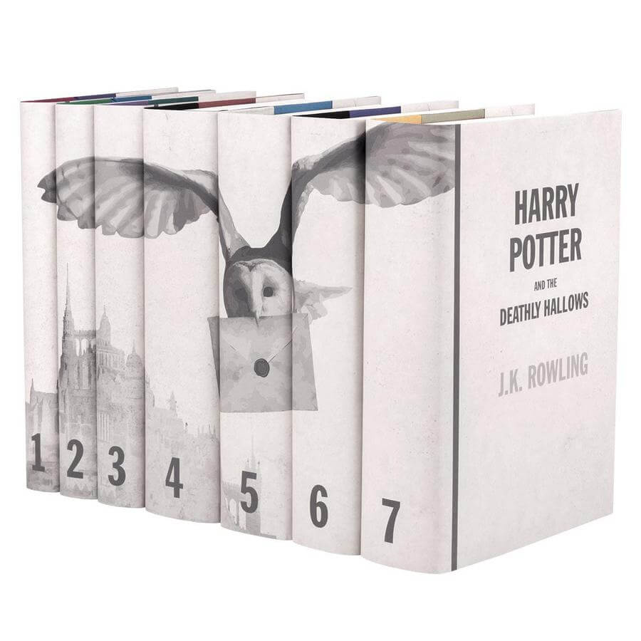
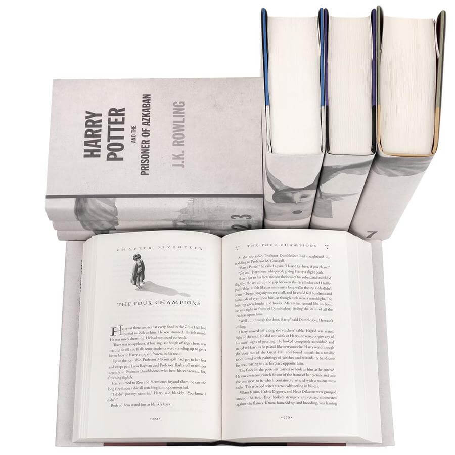
The design created by Juniper Books is mainly focused on the seriality of Harry Potter, placing the emphasis on the pattern running along the spines. (As they often do on their other books as well). The covers of individual books appear to have got a little less attention. However, I still like this clean look, which represents both the more serious and the playful vibes of the Potter-books.
Juniper Books has come up with several Harry Potter cover collections, so if you like the concept of macthing spines, you might want to check out the others as well.
Minimal Planets
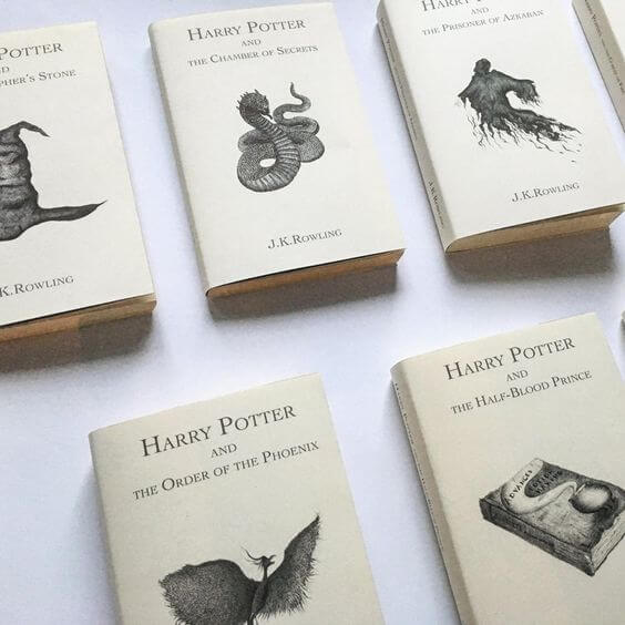
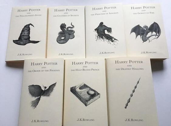
My personal favourite is the cover collection created by Eva, the artist behind Minimal Planets. Usually only real classics are bound in such a cleanly designed cover, which, for my part, fits HP perfectly. Even though publishing houses apparently want to hide the serious aspects of Harry Potter in their cover designs, this project represents just how much HP is a classic, with its clean typography and beautiful illustrations.
These covers are in fact dust jackets, that you can order and fold onto the books you already own. You can order them via Etsy, and send the exact measurements of your book to the artist, who will create a cover for you specifically – and add your name on the inside cover.
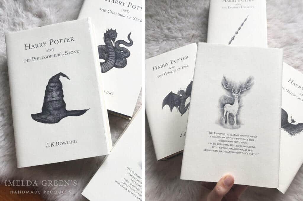
Thank you Eva, for sending me a copy of your beautiful designs.
Olly Moss
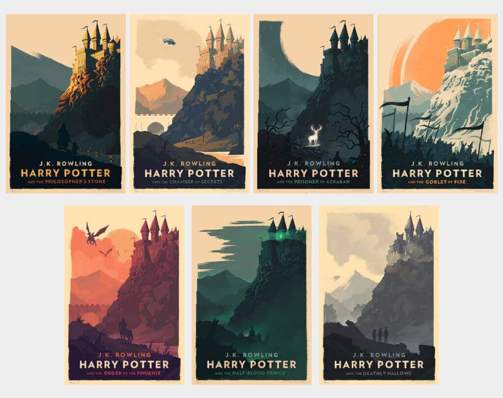
This series was not primarily made as a book cover, but as a poster set, yet I included it in this collection because it could function as a book cover very well. Olly Moss also designed book covers for Harry Potter (which you can easily find in his portfolio), but these posters convey such a strong vibe that they seemed even more exciting to me than the original covers.
Natalie Andrewson
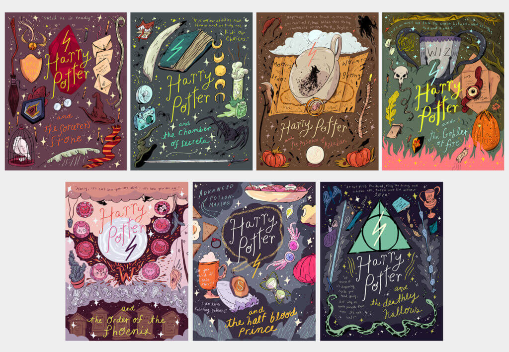
The last series is a playful, lighthearted collection, which, while similar in its message to the first-edition covers, still has a much more modern look. Natalie Andrewson’s Harry Potter artwork was also designed to be posters, but they work well as book covers too. These covers can also be purchased as a prints.
So these are my personal favourite Harry Potter book covers. If you find more Harry Potter art online that is especially well-designed, please share it with us in a comments below!
