Graphic designer in the making – sketchbook tour

Those who read the blog will not be surprised if I say that I’m not exactly a fan of institutional art eductation. Teaching art is desparately hard: on the one hand the student needs to see if he is on the wrong track, on the other hand creativity is a very fragile thing, which can break very easily at the wrong touch. Criticism has to be put very cleverly, yet it has to be said, if the wish is for the student to grow.
At my old university, these expectations were not fulfilled. They usually tell you right in the face that what you are doing is rubbish, which I still haven’t got over completely. However, despite all negative experiences I have decided to give it another go: I am now back at school, studying graphic design at Corvin Art School, Budapest.
What makes a graphic designer?
These days everyone calls himself a graphic designer. Funnily enough, nobody claims to be a brain surgeon unless they complete the necessary education. Quite unlike graphic design, or even writing, which somehow ‘anyone can do’. There are a few professions, which some people consider much more of an ability, rather than an occupation, and therefore do not acknowledge the winding road leading up to that profession. Obviously, this often causes resentment in those, who have actually put in the time and energy to become experts at their fields. This has led to a rather strong sense of community among graphic designers, which sometimes turns into haughtiness on the brink of arrogance.

The self-taught gang has got one thing right though: unlike brain surgery, you can start to teach your eyes to differentiate between good and bad design at home just as well. If someone browses through top logos for years on end, he will certainly have more experience than the ‘professional’ who struggled through his education but has no particular interest in the subject.
I believe in self-teaching, I believe I can call myself a graphic designer if I’ve been working in the field for 5+ years. And yet… these past few years the voice of this little devil inside me kept speaking: ‘You cannot ask for the same amount of money as a professional, you are only a self-proclaimed designer!’ Or: ‘Tell your client that you are not professional, this is the only way it will be a fair deal.’ This voice had been sucking my blood for so long that in the end I answered back: ‘F*ck it! Then I’ll do an art course and become professional. Happy?’ Since then it’s silent inside.

Practice, practice, practice: here is my sketchbook
I’m not entirely sure where this course will lead me, but it has already got one advantage: due to the fantastic amount of work that I’m required to do from week to week my creative muscles have started to develop rapidly. The most difficult part of the creative process is always to start, and procrastination sometimes gets the better of me. Nowadays I havent’ got that luxury: if I don’t create continuously I won’t be able to keep on top of things – and so my sketchbook grows accordingly.
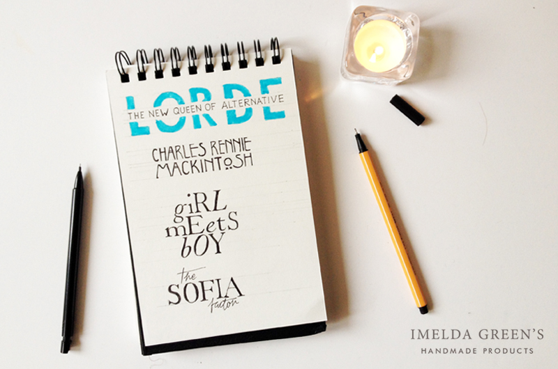
We often get the task to copy logos and titles to practice typography and develop an eye for proportion but these exercises also helped me to get used to drawing in a sketchbook. Up until now I haven’t had the courage to draw in a book like this.

So what is a sketchbook?
A sketchbook is way more than a simple notebook. It is a little book, that contains studies as well as artwork, and represents artistic value on its own. Officially it is a very personal place for drawing, where the artist can work freely, without expectations. However, many artists take care to only put good quality work in their sketchbooks (whether it be studies or notes), which they can add to their portfolio later.
It was precisely for this reason – the expectation of good quality work and pretty general aspect – that I hadn’t started drawing in a sketchbook before. What if I spoil a page? Of course the answer is ‘nothing’. But you only realise this once you actually start a sketchbook. I fooled myself by choosing a spiral-bound notebook, so I have the chance to tear out any spoiled page unnoticed. Needless to say, I haven’t torn out any of it yet.

How to choose your sketchbook?
A sketchbook is just like an expensive pair of shoes; drawing the first line is just like putting it on for the first time, when it feels hard to break the smoothness of the leather. The more beautiful the shoes, the worse the case. This applies to sketchbooks as well – kind of. A really beautiful notebook will only increase your fear: what if you ruin a beautiful notebook? This is why I chose a simple black sketchbook (every designer is a snob and loves black, me included), which is not too beautiful to be wrecked.
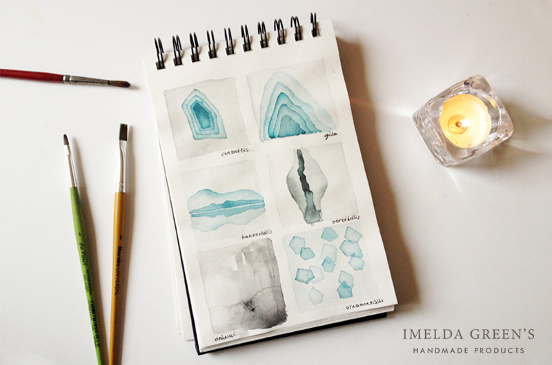
However, there is something much more important than the cover: the pages inside. You need to decide what kind of techniques you are going to use and choose the paper accordingly. I knew that sooner or later watercolour will pop up in my sketchbook, but I thought I would mainly work with pen and ink, so I settled with a mixed media paper.

Don’t forget to take the binding into consideration. A spiral-bound sketchbook can be difficult to use while you draw on the left side of the book. If you know that this will disturb you, look for a different knid of binding. If you still want to settle with spirals, you can choose one where the binding is on the top of the sketchbook. This is what I did, but I was disappointed with it after all: it is difficult to flip through the pages and it is rather inconvenient to balance my hand due to the thickness of the sketchbook.
Think about the size of your sketchbook too! I usually like working in small, so I chose a sketchbook of 13,9 x 21,6 cm in size. Strangely, this turned out to be too small. I wanted my notebook to fit into my handbag, but my next one will be one size bigger, as arranging my skethes is slightly problematic in this size.
The details of my sketchbook shown in the pictures
Brand: Canson “C” á grain, Mixed Media
Size: 13,9 x 21,6 cm (5,5″ x 8,5″)
Paper: 40 sheets, 224 gsm
Available here

Have you worked in a sketchbook yet? What are your experiences?


Comments (2)
Romica Spiegl-Jones
January 25, 2018 at 10:47 am
Hi Imelda,
nice to e-meet you :) I just read your comment on my youtube video (thank you for saying hello :D) and it’s nice to hear your thoughts on going back to art school/university for graphic design. For me, it was such a leap of faith to change career and go back to university just to realise after the first year that I want to specialise in illustration, and that I’m not as much in love with typography as I thought I was. I still love beautiful type but realised I rather enjoy other people’s work than do it myself. It was wonderful to see your sketchbook and the fruits of many hours of hard work. Your blog is beautiful and I love the vibe of your photographs. Keep up the good work, but I hope you can take a well-deserved rest at some point if you haven’t already :)
Paula
April 9, 2024 at 12:42 am
Tracing existing fonts and pretend to have designed is kinda lame, LOL! Graphic designer here, I recognized so many fonts I’ve lost the count. This is just another fake “aestethic” sketchbook… Not genuine at all.