
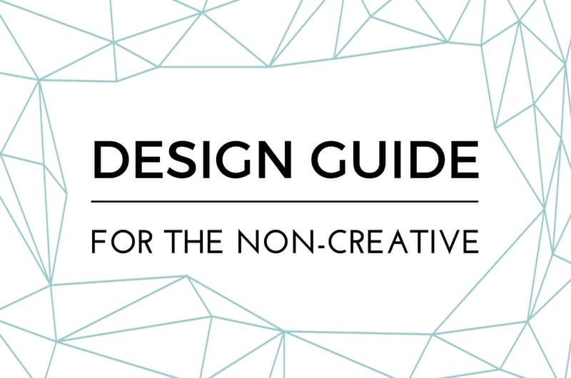
Design guide for the non-creative
Sometimes I feel that the visual world – whether it be a blog, a photo, a graphic or an illustration – has split in two. One half creates clearer and more beautiful work by the minute (even with occasional highs and lows), the other half takes worse and worse steps making me scream “WHY???” Of course this sounds utterly snobbish, considering I am neither a photographer nor a graphic designer by profession – though I am an architect, so I know little bit about the matter. However, I think if you follow some golden rules, it is possible to create visual content which is both appealing to the eye and doesn’t make professionals tear at their hair.
The steps below help me in painting as well as blogging, but you might find them helpful even if your goal is simply to create a prettier Instagram feed.
Useful over pretty
A beautiful result is naturally important but if the finished work cannot communicate what it should then it simply hasn’t got the right to exist. I meet this problem quite often on Pinterest graphics: the beauty of a script font sometimes overrules readability, or the creator is so much in love with the background photo that the overlaid text becomes unreadable. Whatever you make, you should bear in mind what the purpose of your creation is and stick to it!
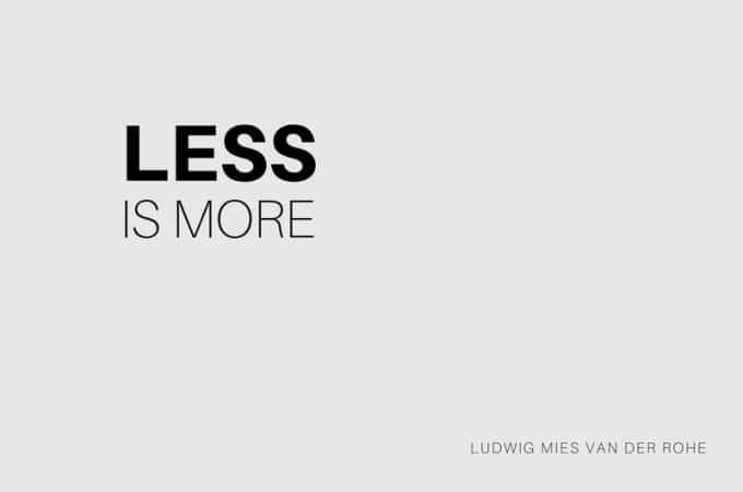
Less is more
I would not be me if I left out Mies van der Rohe’s memorable statement from this collection. It has been repeated a little too often, but the meaning is still as fresh as it was when the words were spoken. Stay clean! Minimal design is everything, in every possible visual field.
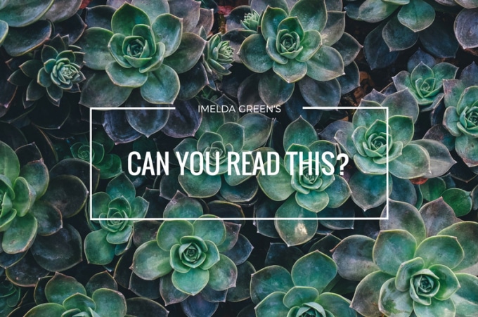
That white space…
Contrast helps highlight the message as well as setting the mood of the picture. As a rule of thumbs you can use the “light on dark, dark on light” principle, which can be altered depending on the mood you want to convey. If your background has strong contrast or you cannot decide whether you can accentuate your design with dark or light, you can saturate the background to help you – or you can use filters to lighten or darken your background.
So what about filters?
A photo full of filters is like a beautiful woman wearing too much make-up: if the original piece looks good, then a touch of digital work will accentuate its beauty, while too much will distort it. But if the original image has bad composition or has no character, then however many filters you use it will be rubbish. Do not over-edit your images – unless the purpose is to give background to text, then of course you can darken or lighten it according to your needs.
‘Undo’ button is your best friend
If you edit your works digitally, the most useful keyboard shortcut to learn is ‘Ctrl+Z’, the ‘undo’ button. It is very important to experiment, but it is even more important to see what’s working and what’s not. If you cannot manage placing the text without hyphenation then consider using another background. Re-design and re-design, even if it takes looking at it with fresh eyes the next day. The finished work needs to work (see point 1)
Stay sober with colours
Unless you want to convey precisely this message, ‘the more colourful the better’ concept should be left behind. There are loads more shades of grey than 50 between black and white, so use them! If you work on paper, don’t be tempted to use all those 36 coloured pencils at once, try to choose 5-6 main colours, which you should try first on a scrap of paper to see whether they work together before colouring your masterpiece.
I don’t always manage to follow these rules either, and of course it is okay to make mistakes. However, I am trying to bear them in mind all the time, so as to achieve better graphic results. What are your design principles?
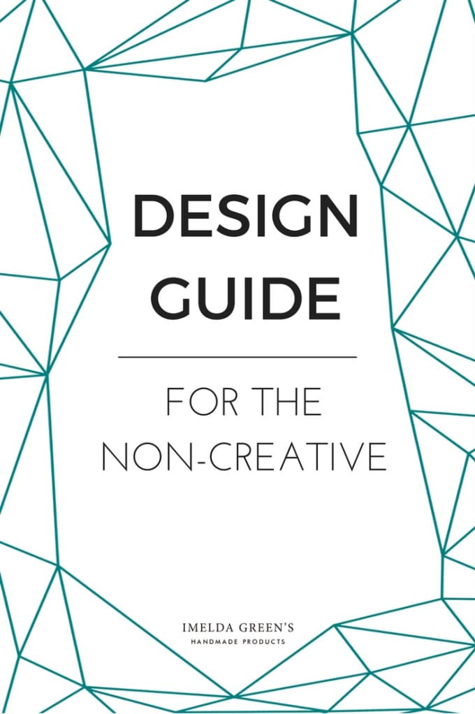
Liked what you read? Pin it!